Project Brief
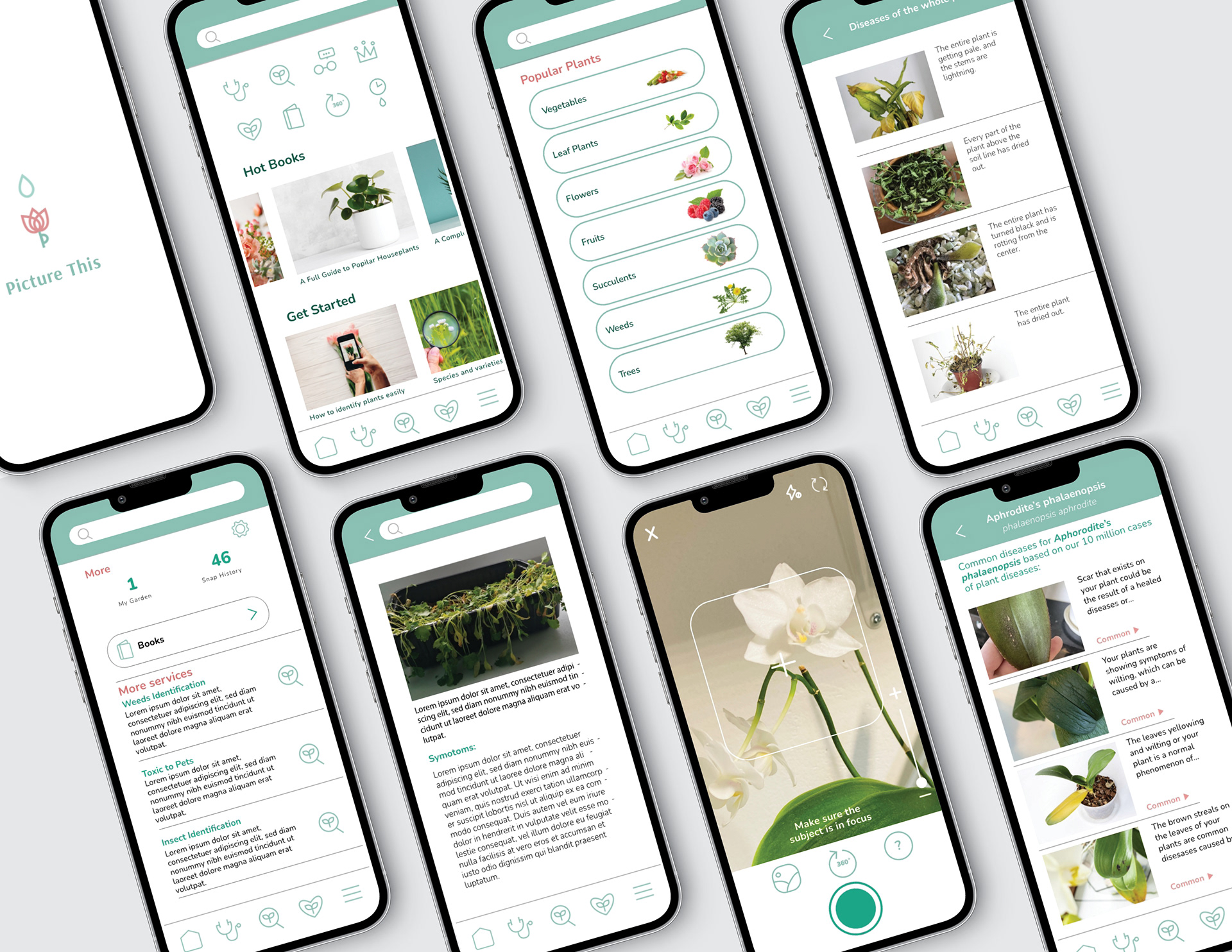
Overall the current app shows a user-friendly and efficient interface. Having said that some elements need to be updated as we can see some design approaches that might be going to be outdated soon such as colours and gradients.
Goals
• Shows a clean and simple interface
• Doesn't need dramatic change, add a few adjustments
• Make icons simpler and more recognizable

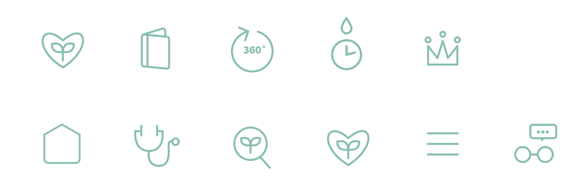
Iconography
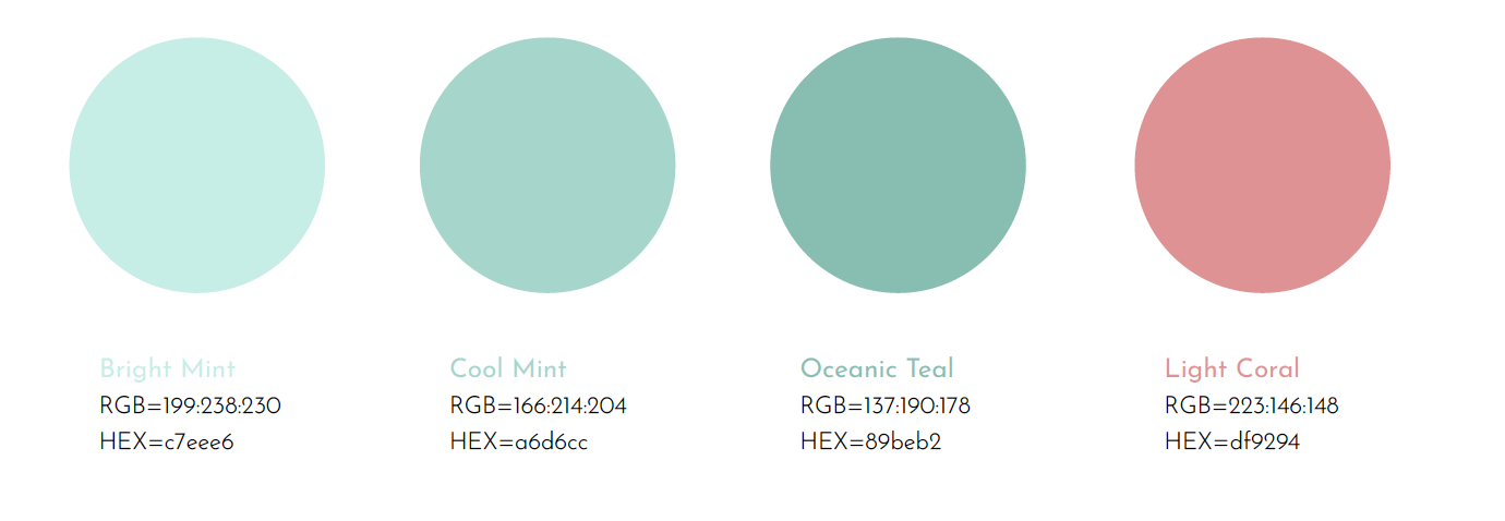
The overall approach is to be consistent and clean, the icon colour is matched to the brand palette (# a6d6cc). The original interface included descriptions below each icon but I decided not to add text to keep the layout clean and simple.
Design Process
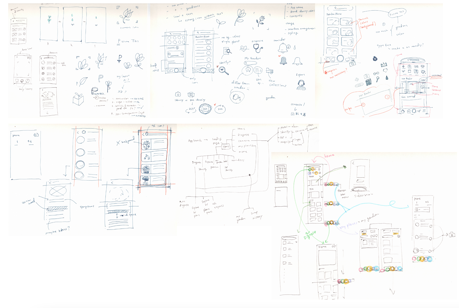
In the same process as other graphic design projects, I started by brainstorming ideas by sketching as much as possible. Since UX / UI is not a familiar topic to me, I struggled with deciding which content to add or delete.
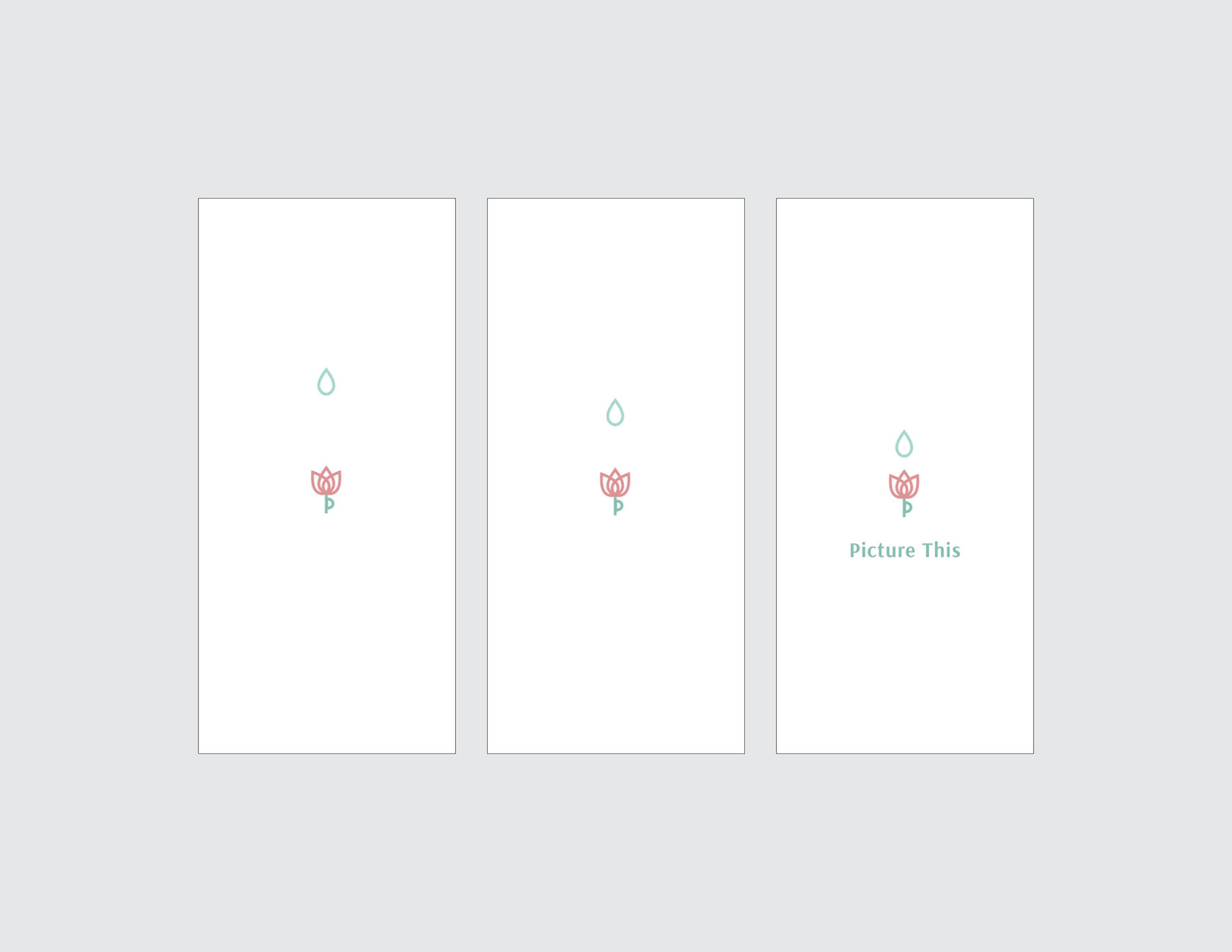
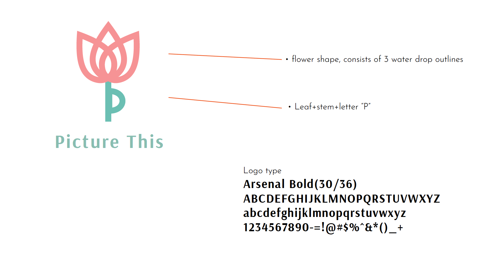
The splash screen shows a very short animation starting with a water drop and a flower-shaped logo.
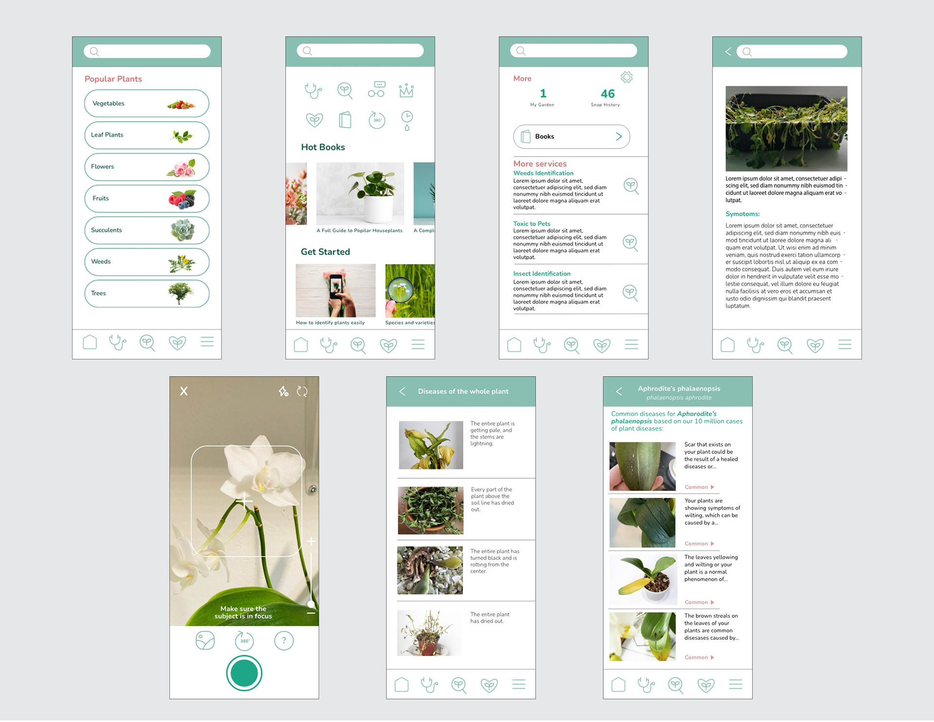
All layout shows consistency and clean visual design.
Programs used: Adobe XD, Photoshop, Illustrator