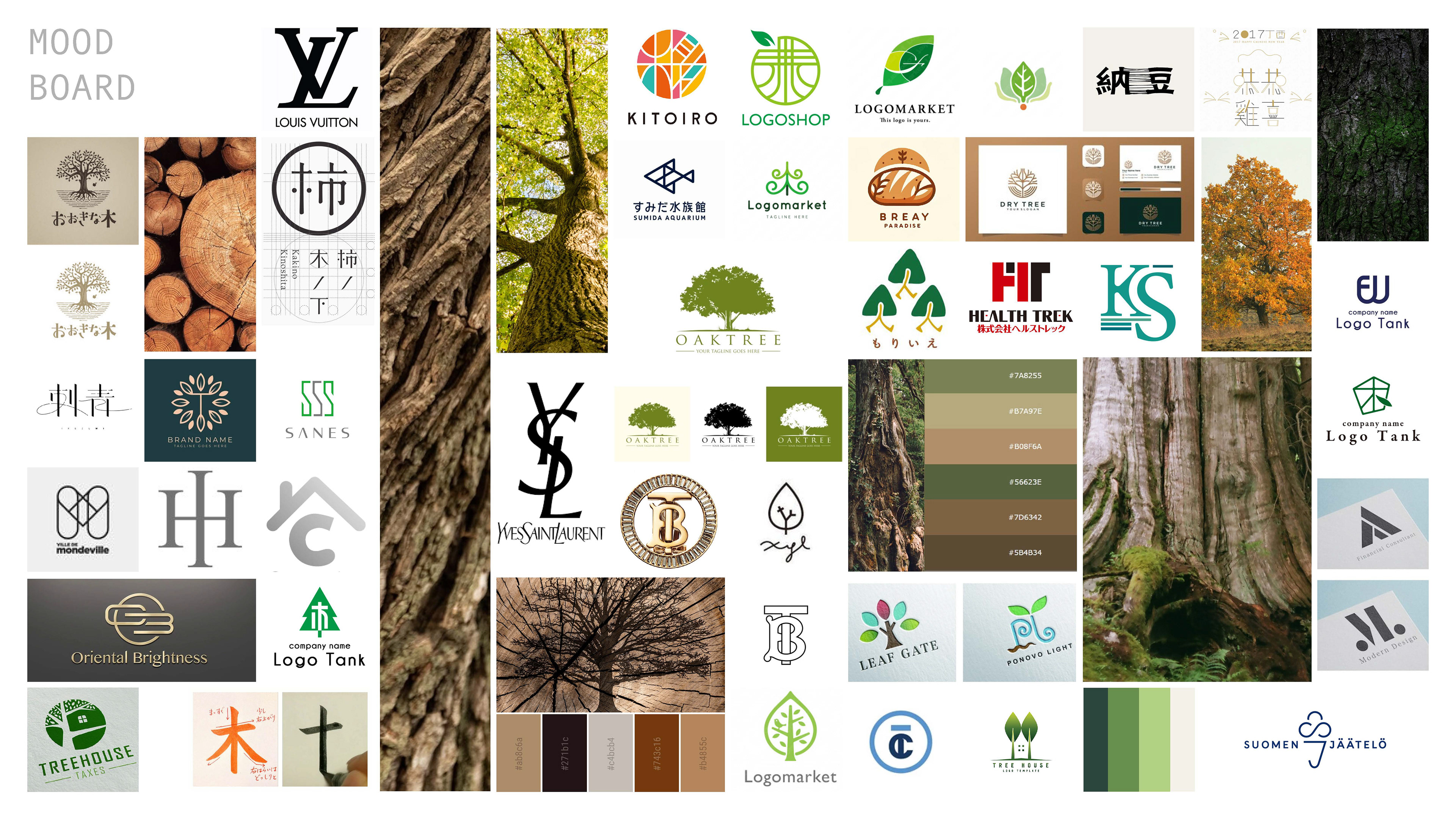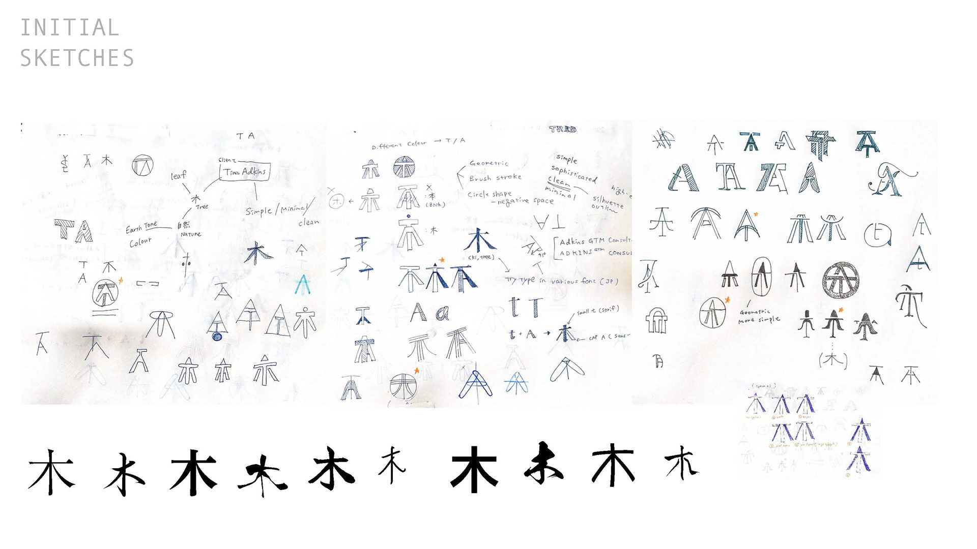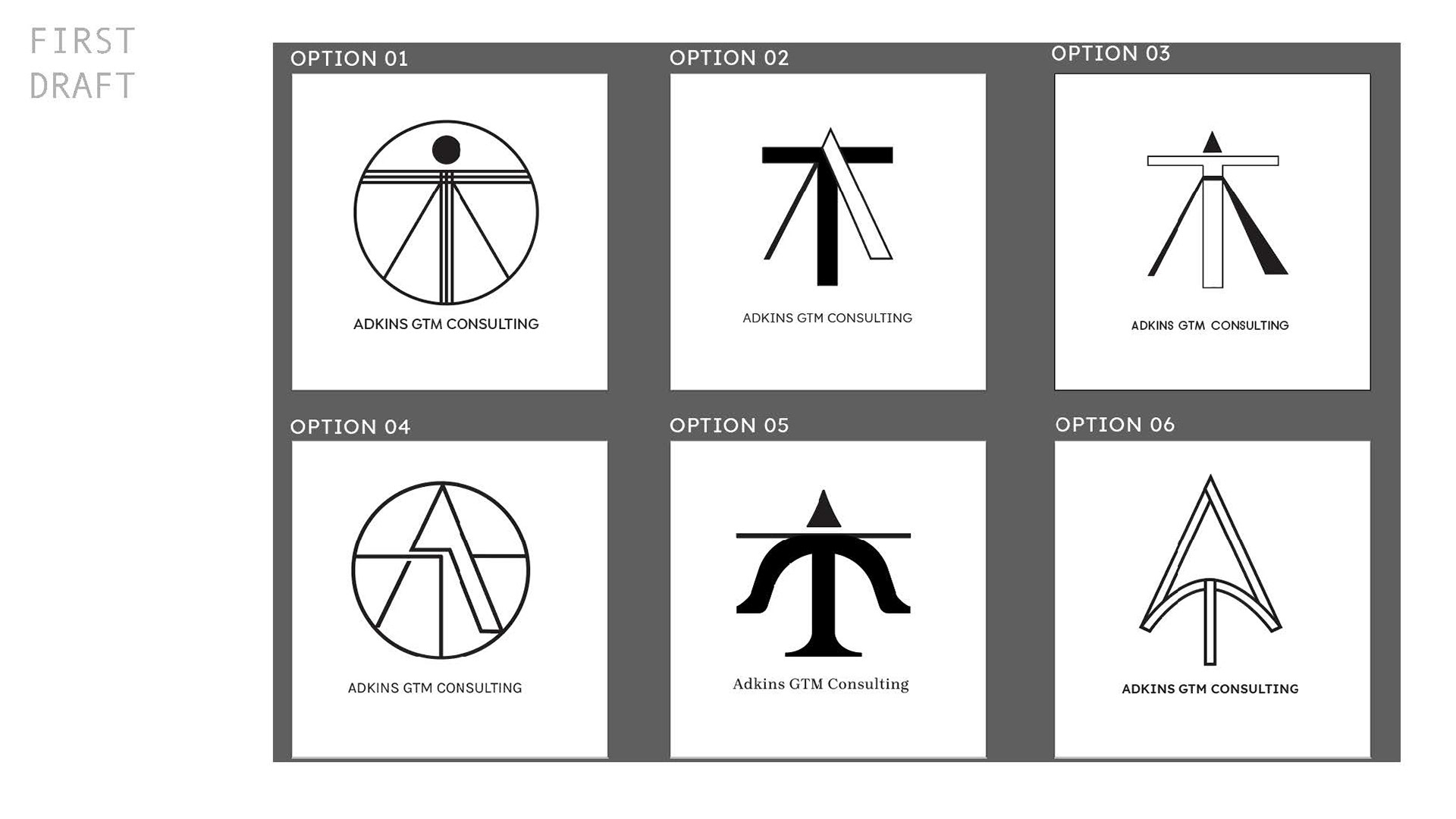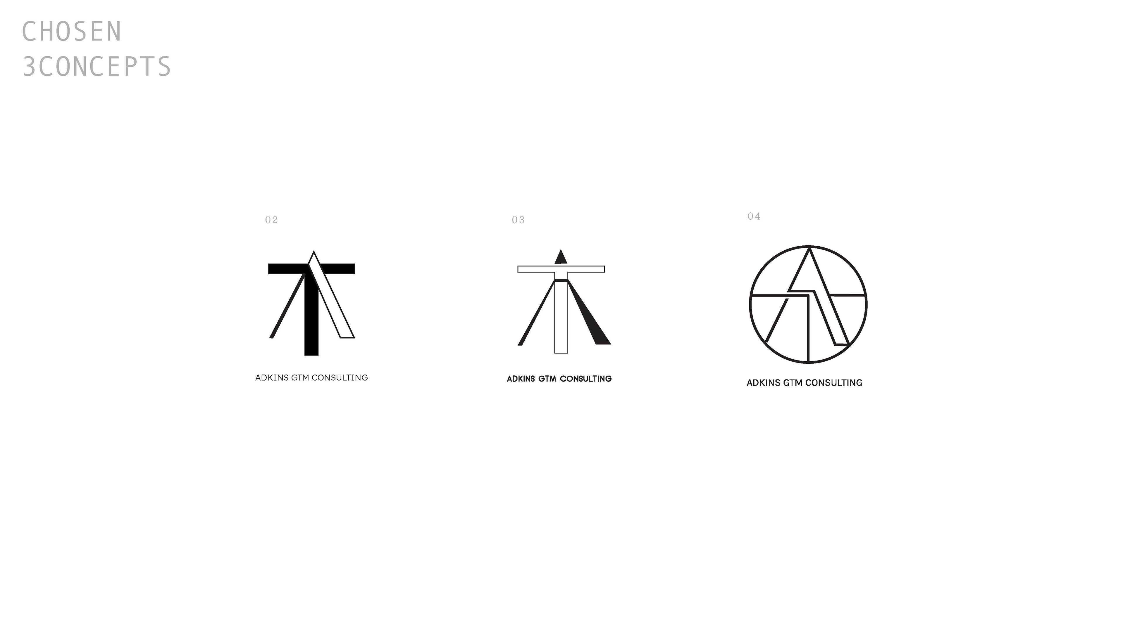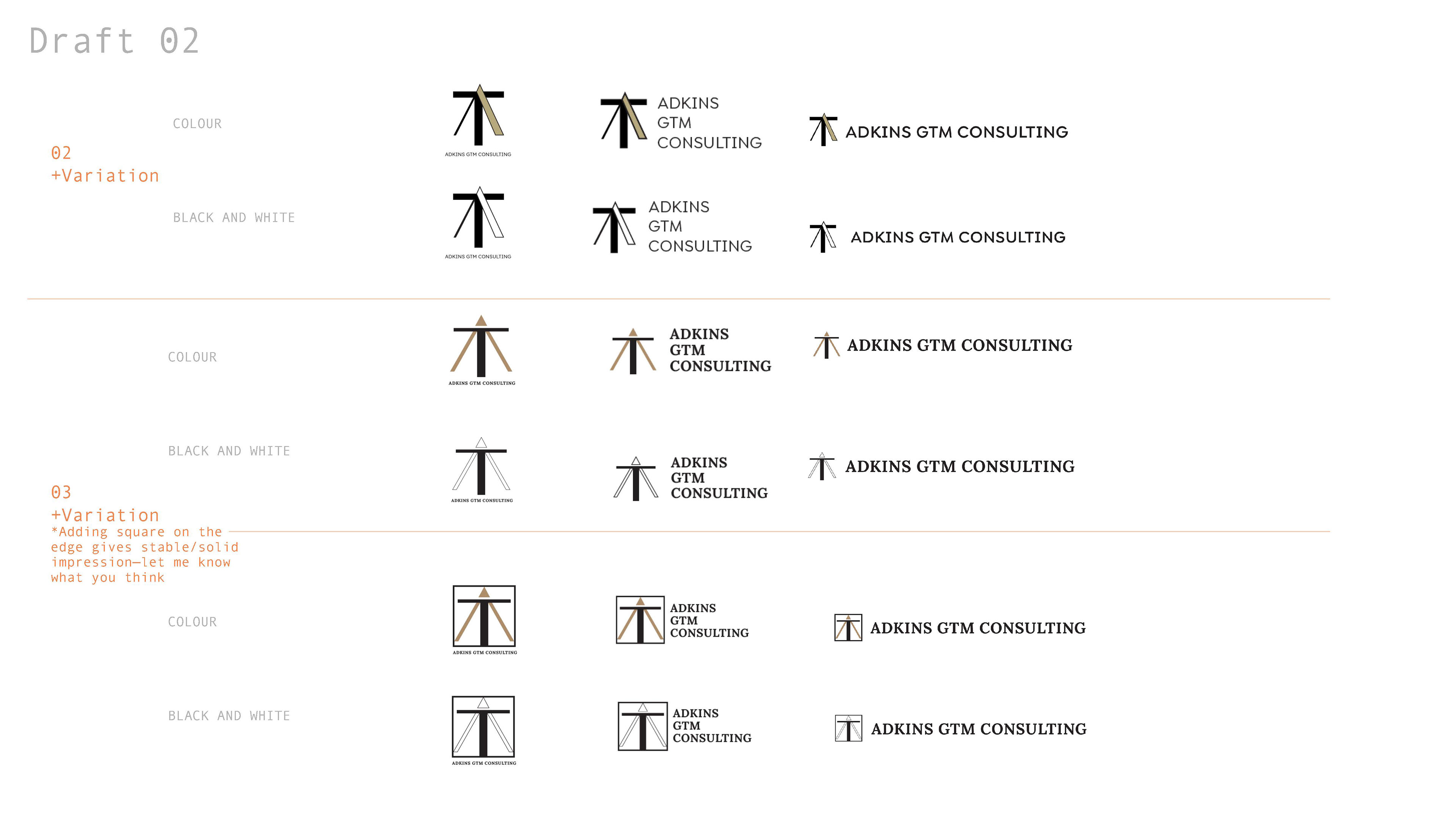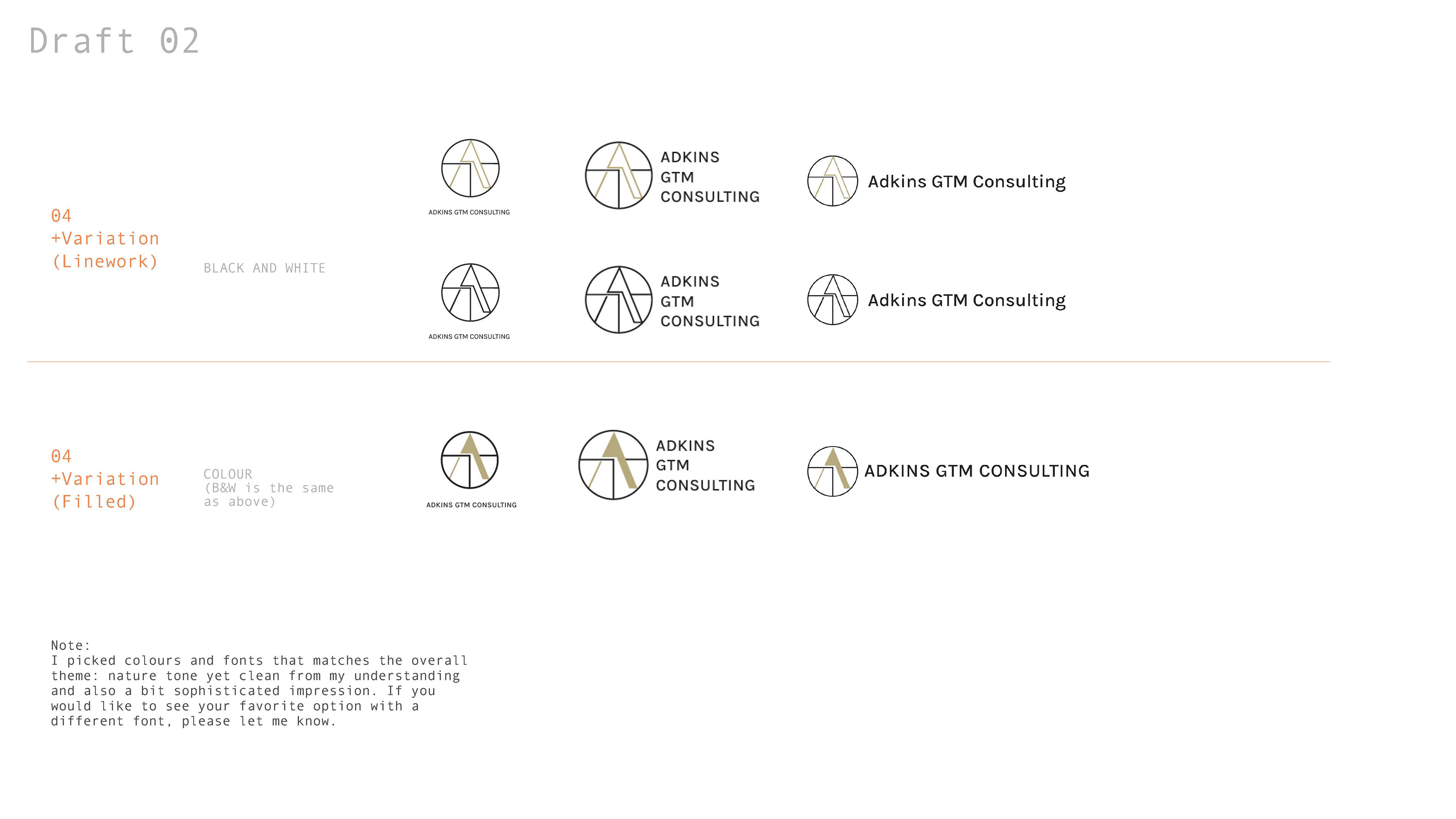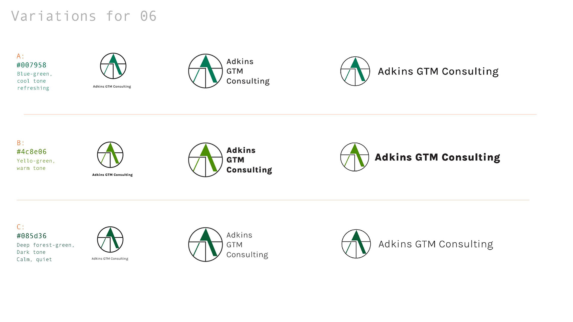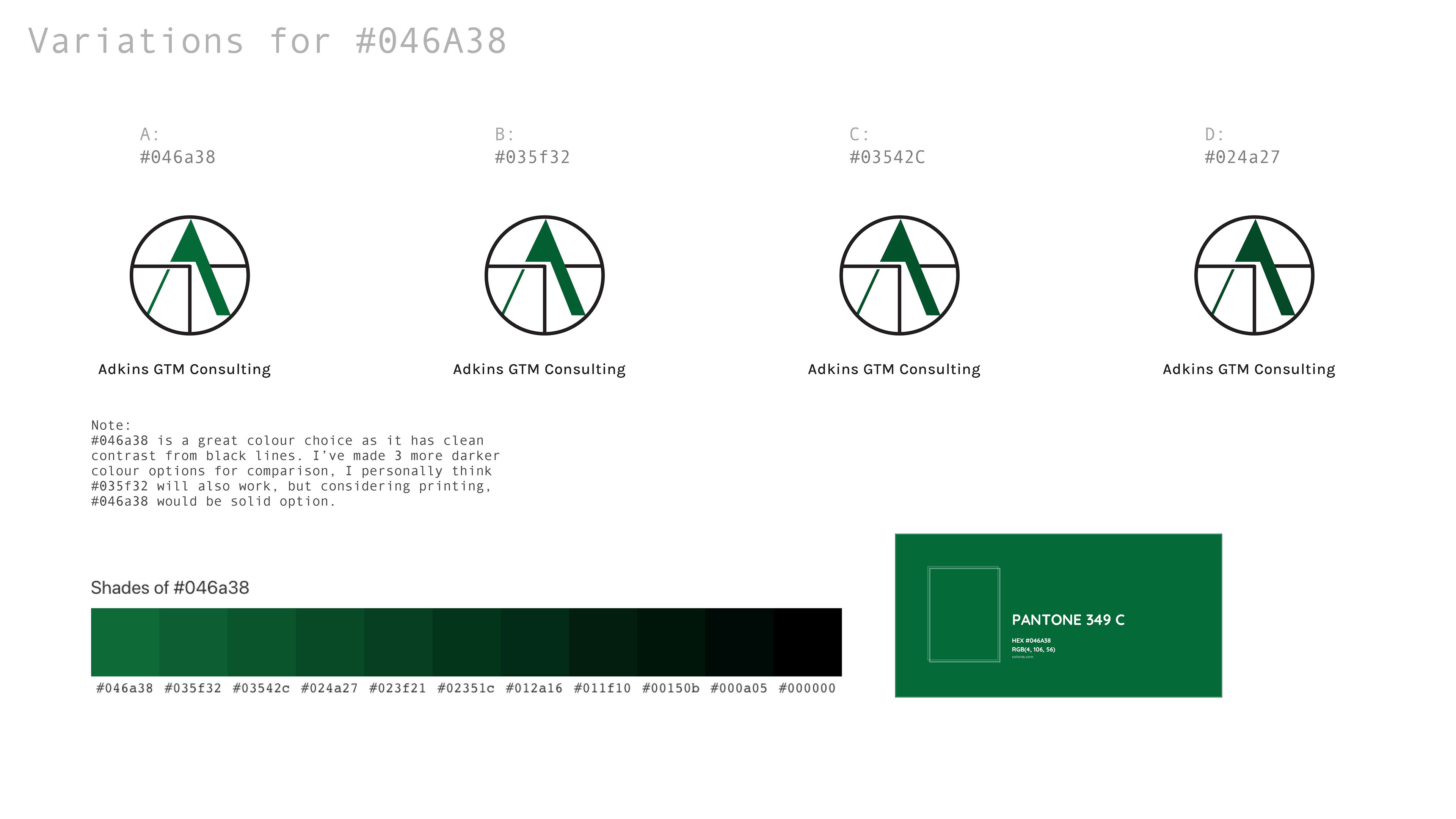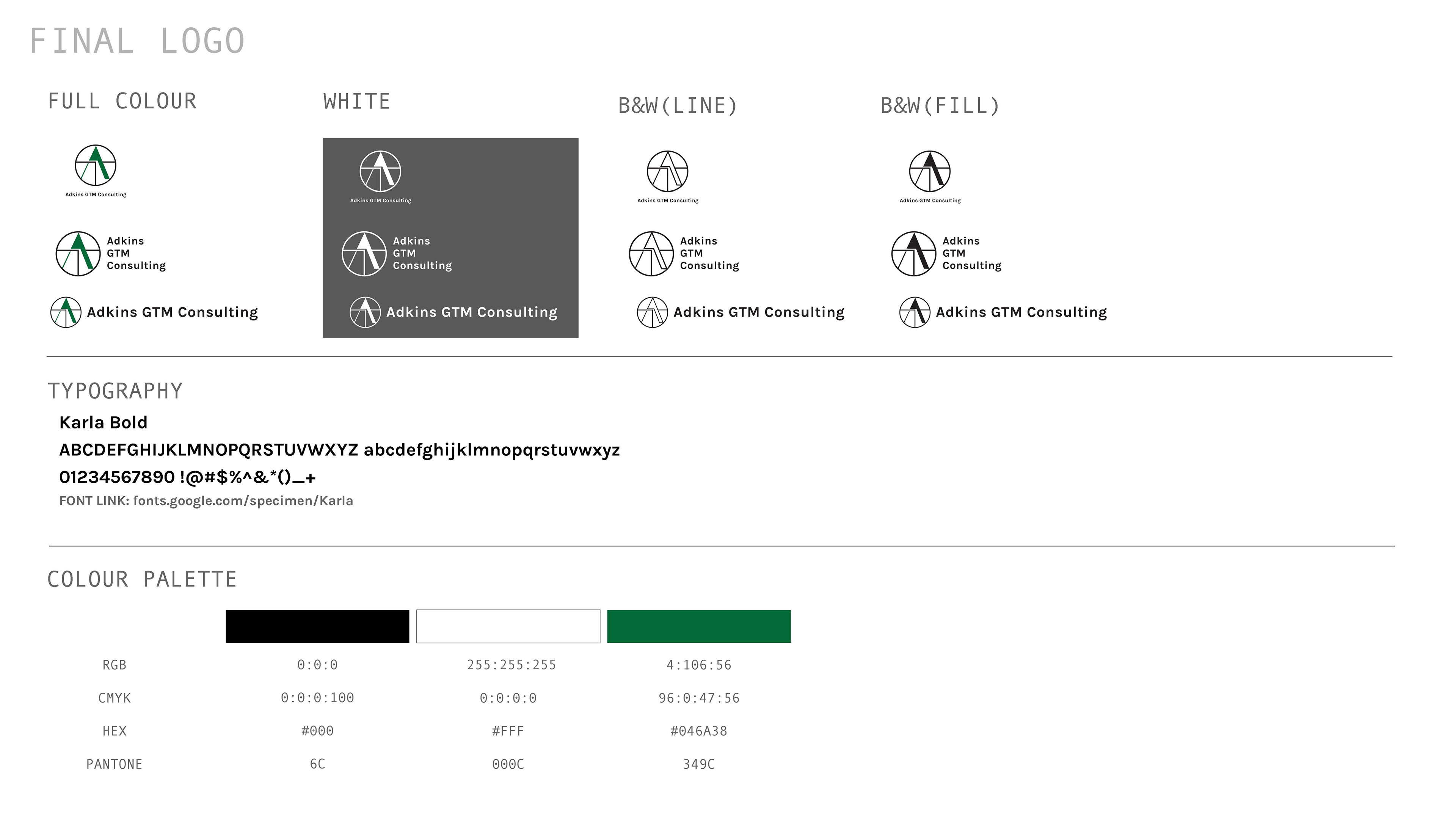
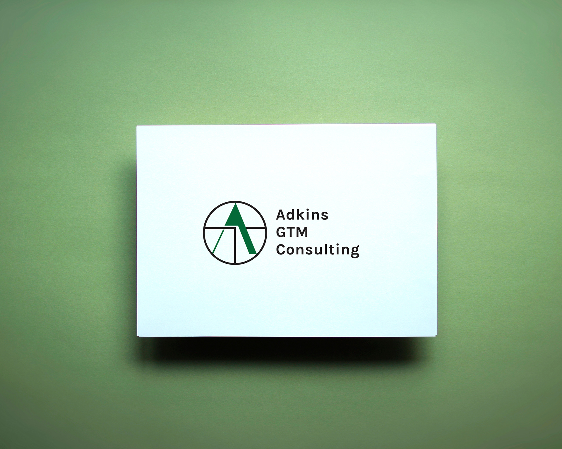
This client is an individual consultancy that offers product marketing services to the environmental services industry. He had the idea of superimposing his initials, TA, to resemble the Japanese kanji for “木” or a tree. He wanted the design to hint at an eco-friendly connection in a subtle manner. The goal was to emphasize his initials while including a slight nod to the kanji, making it recognizable only to those in the know or paying close attention.