Project Brief
Penningtons is a plus-sized female clothing brand based in Montreal. Their current branding empowers women using body-positive imageries. For this project, my aim is to add refinement to their logo and overall colour scheme to differentiate them from competitors.
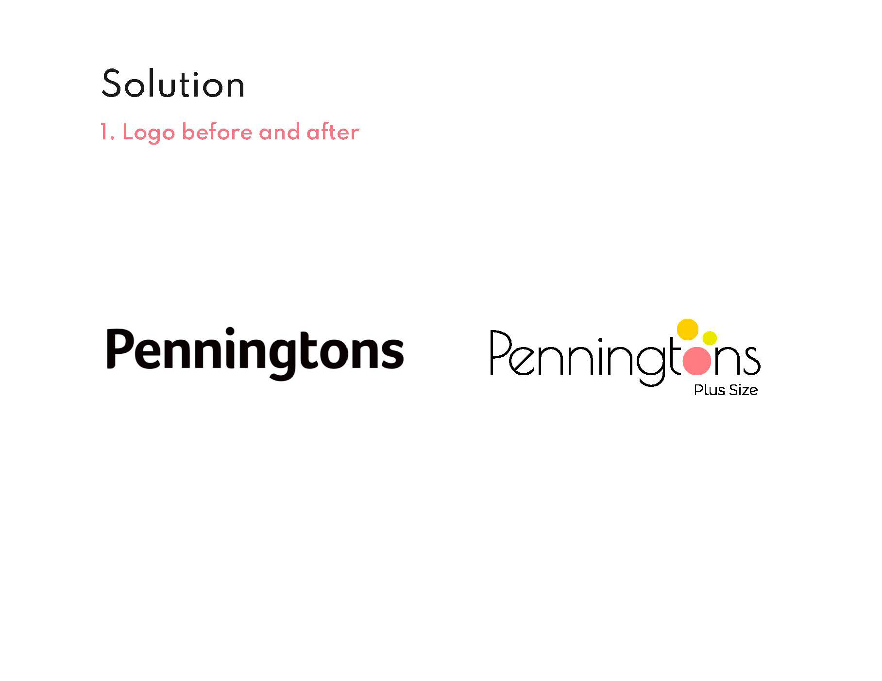
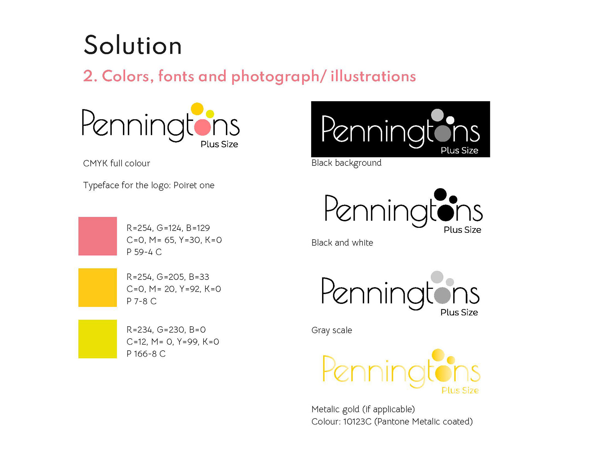
The Logo
For the logo, I used a clean/geometric, and simple typeface (Poiret One) and add a graphic element on the letter O with a few playful and vibrant colours. The original logo is already quite solid as it has a clean silhouette and a touch of soft shape on each letter's edges that indicate feminity, adding colours rather than focusing on shapes shows a more contemporary vision for the brand following the up-to-date trend in the industry.

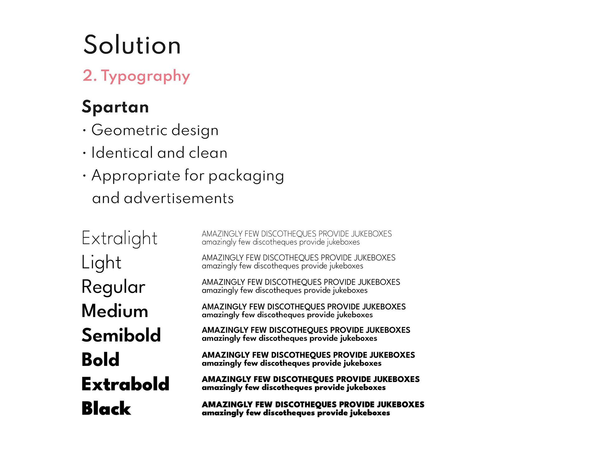
Font and pattern
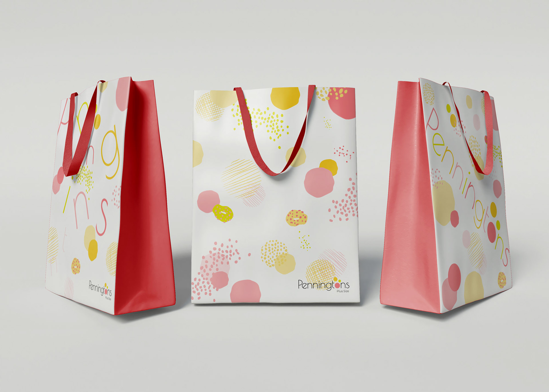
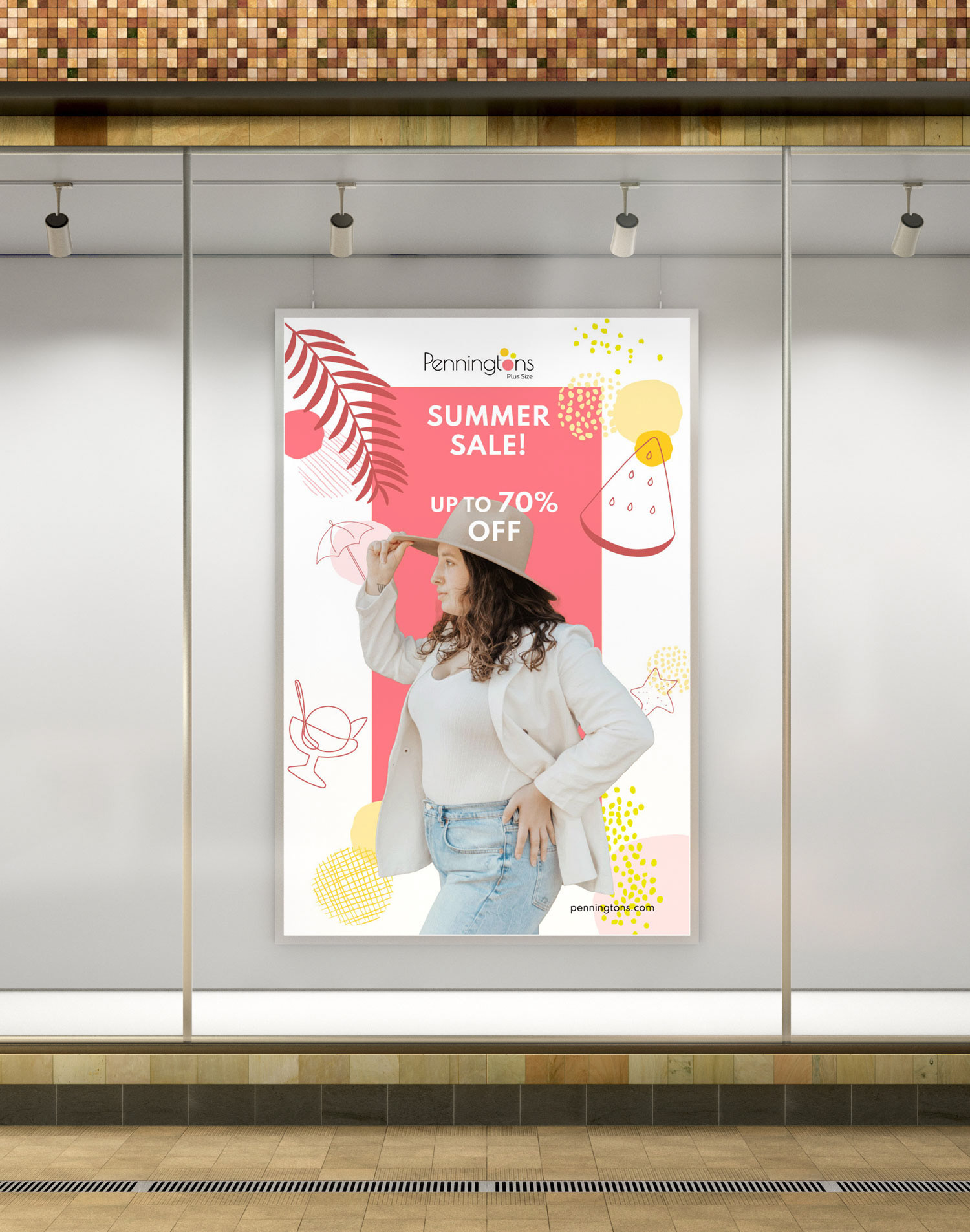
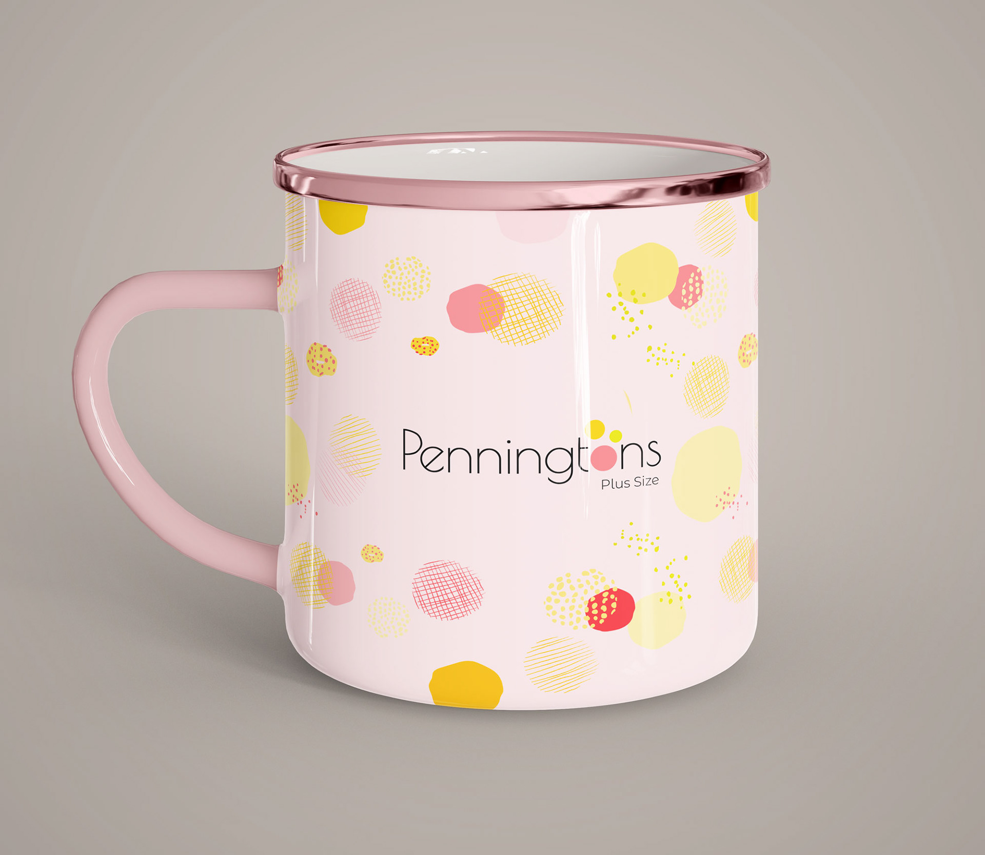
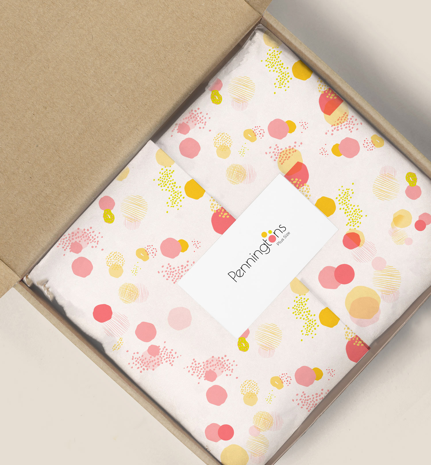
I chose Spartan for the primary typeface, it is appropriate for both print and digital display as it has high legibility and also has a clean and contemporary visual. I made a vector pattern that followed the new brand colours with a playful approach, it will be used in multiple platforms such as web pages, advertisements, and other collateral items.
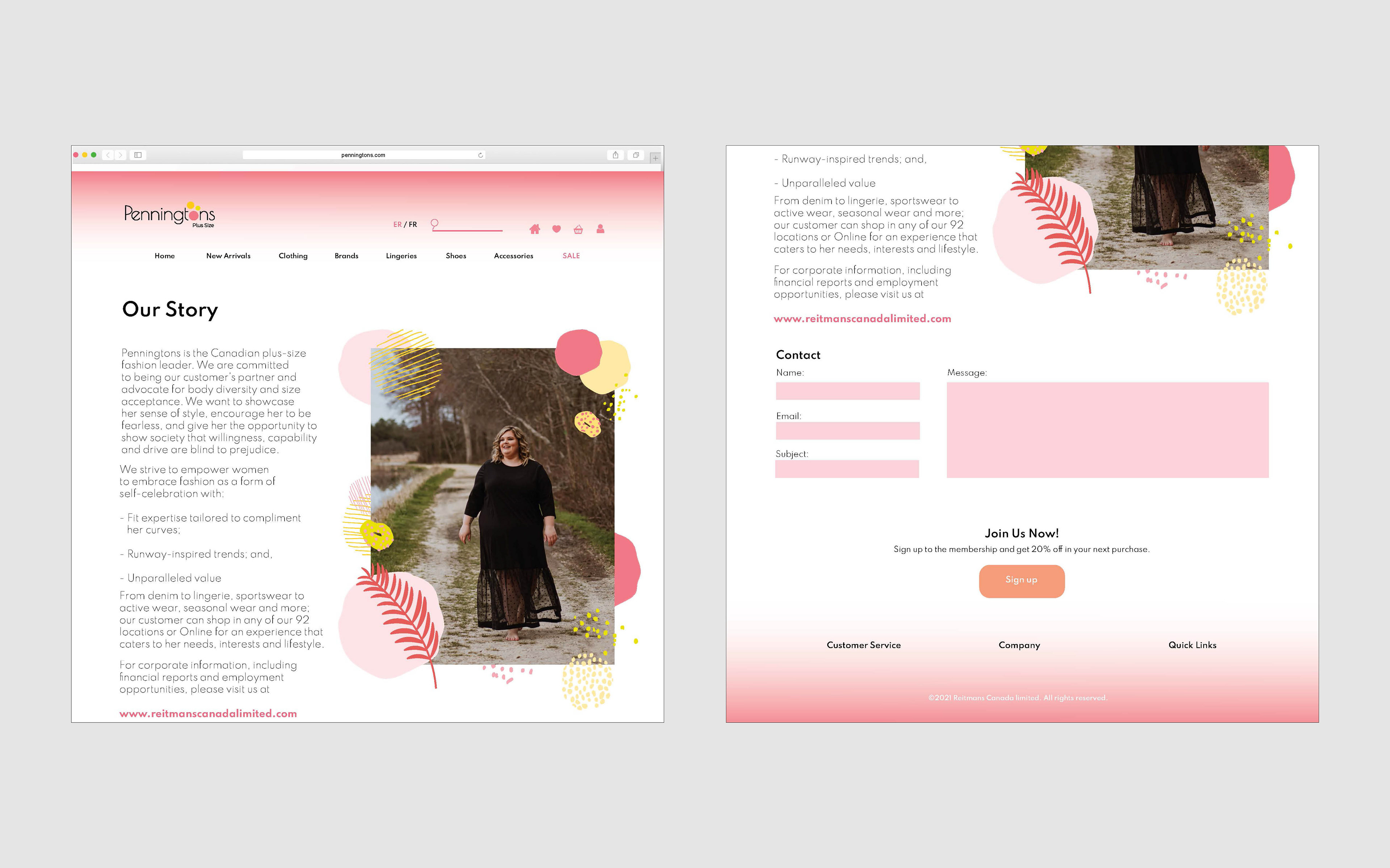
Web page design
Following the new brand colour palette, all the contents are vibrant and playful visual themes. The interface is very clean and simple so viewers are able to reach out to the content that they want to check efficiently.

Other Items
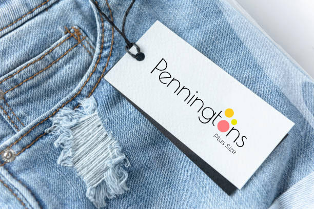
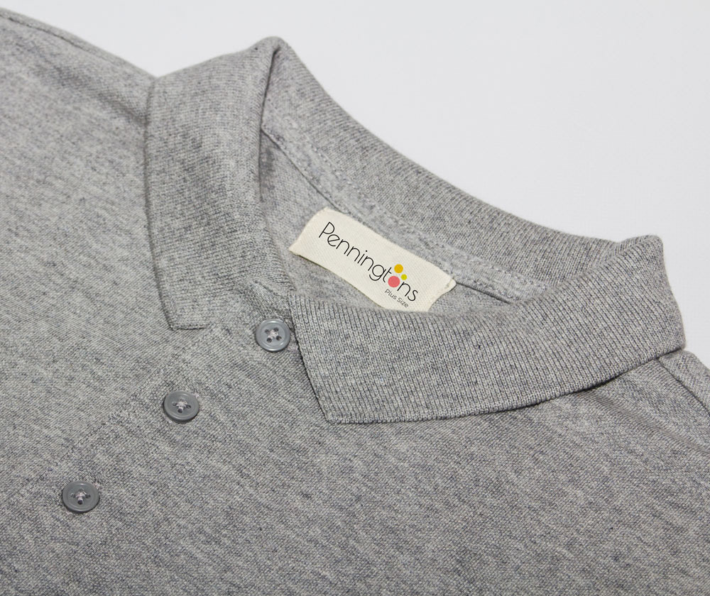
Other items are also following the new brand guide and either have a logo or logo + pattern.


Programs used: Photoshop, Illustrator, InDesign